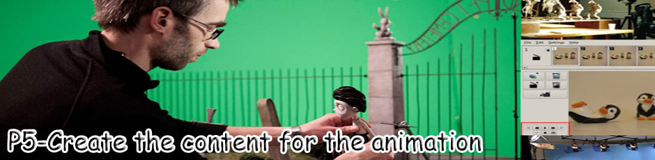
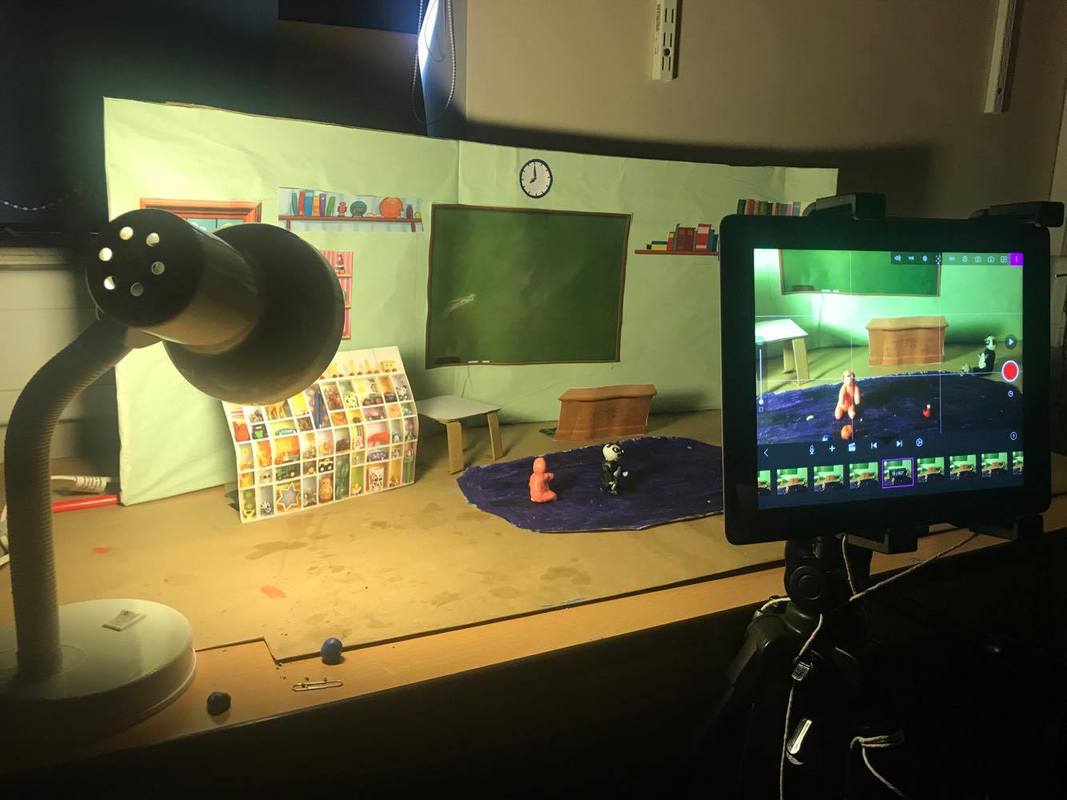
Building my set
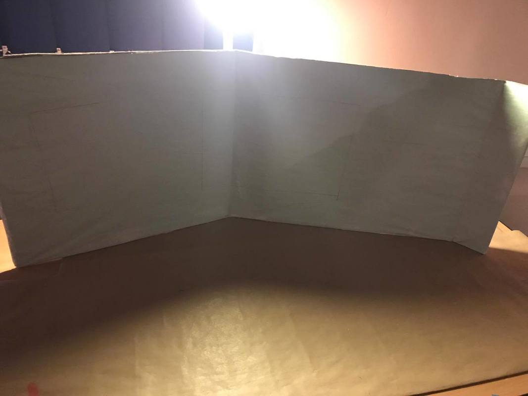
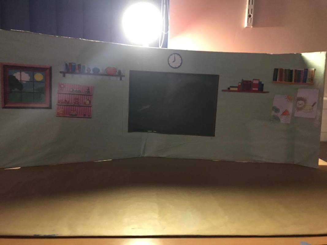
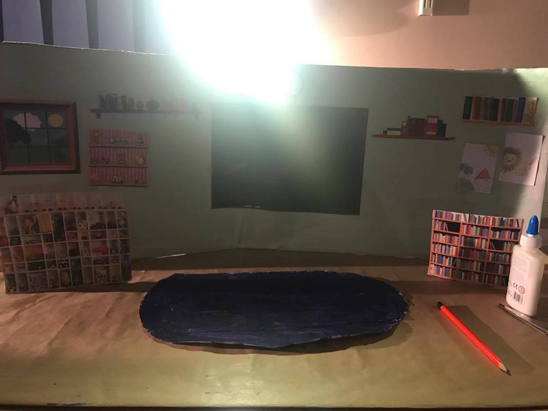
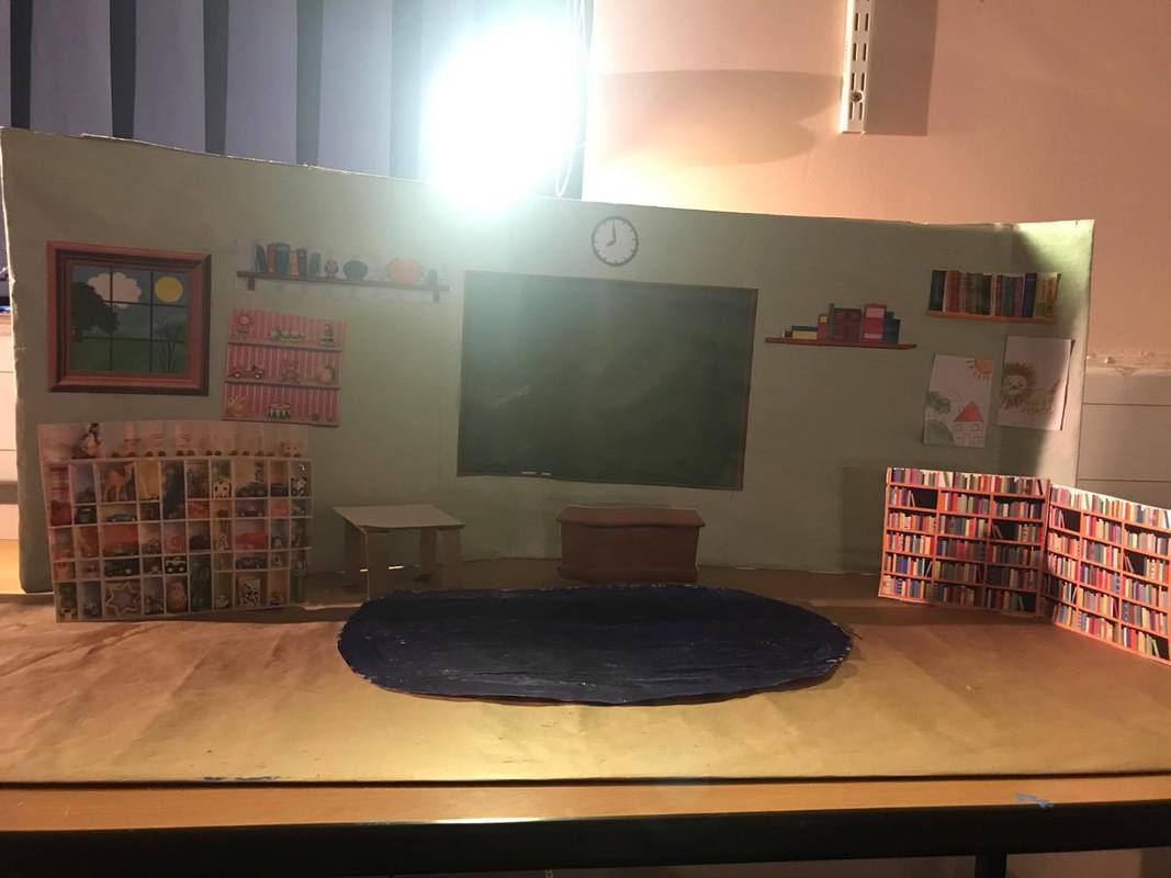
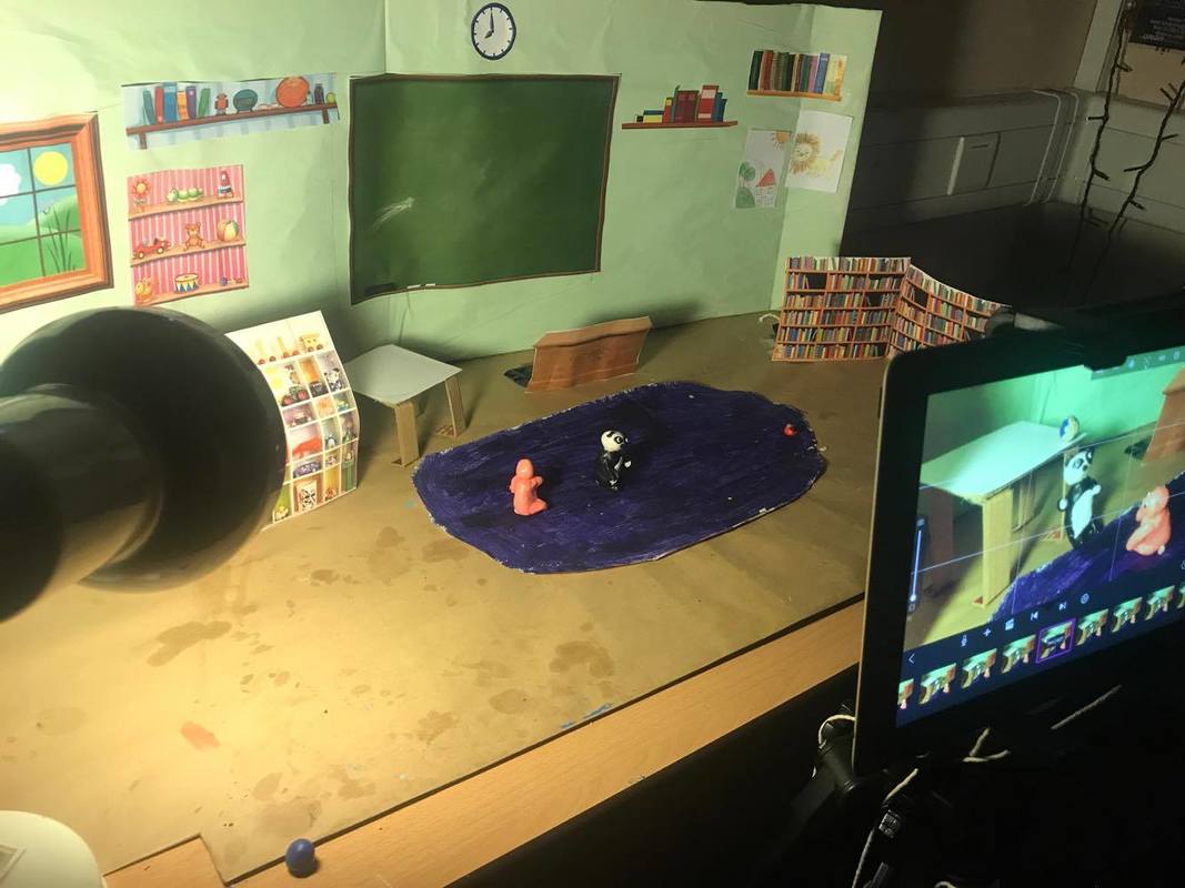
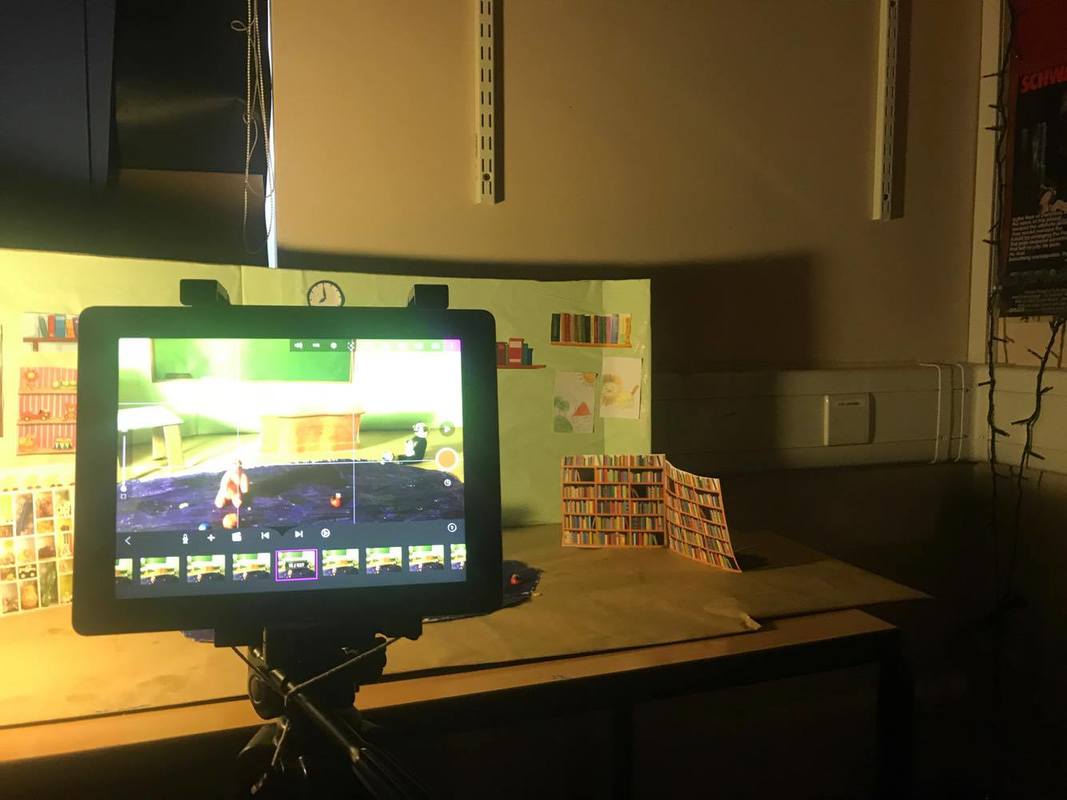
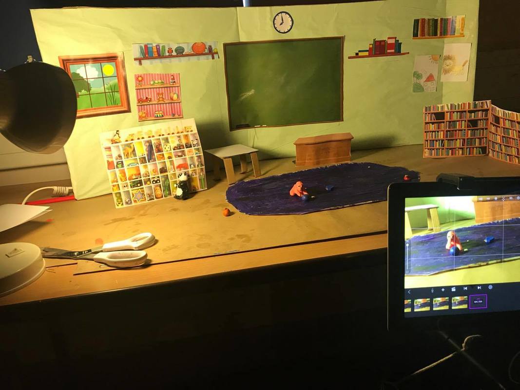
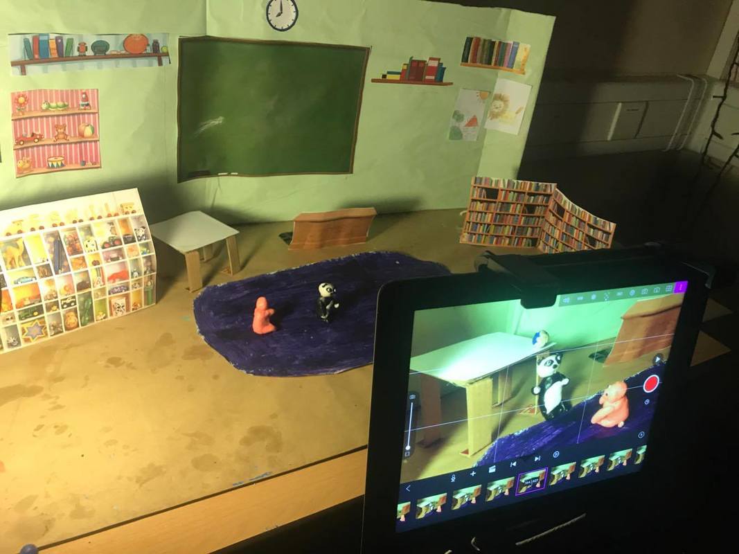
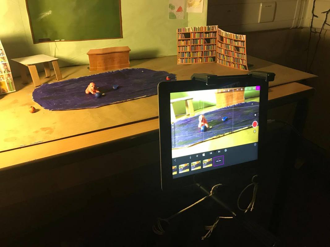
When building my set, I first started off with building the structure, so the walls and floor. I made sure that the main structure was the correct size, I did this by cutting down the cardboard to make sure it was the appropriate size as I didn't want my walls to look too big as it would look out of proportion. After making sure everything was to size I then wrapped my walls and floor with white and brown wrapping paper, this is because it would make it easy for me to paint everything. After doings this I then painted my walls a pale blue, I did this because it was in my final concept art of the environment. I made sure when building my set I had my final concept art next to me so I know what the final outcome should look like. After everything was painted and dried I then proceeded to mark off where everything on the wall should be, I did this because it gave me an idea where to place things and how big the pictures needed to be. I then printed off pictures of things that were needed on the wall, some examples were the blackboard, book shelves etc. After everything was printed to the correct sized I then stuck the pictures on to the wall in the places where I marked them. I then moved on to the floor part, in my plan it said it had a toy box, a table, a book shelf and a toy organiser. I first decided to mark where everything should be placed onto the floor, just so I had an idea on where everything should be. I then printed off the 2 big things on the floor, which is the book self and toy shelf, I printed them off and I then added some backing to the back of them just so they would be able to stand onto the floor, I placed them onto their markings on the floor and stuck the backing down. I then proceeded to make the table out of cardboard, I made sure that it was to the correct size because of the markings on the floor, when finished making the table I then placed it onto its correct place; I did the same thin with the toy box. For the final touches I noticed that the book shelf and toy organiser was leaning forward and was flimsy, meaning that it could be moved easily. To correct this I attached some strings to them and pulled onto the string to make sure it stayed upright and then taped those strings down.
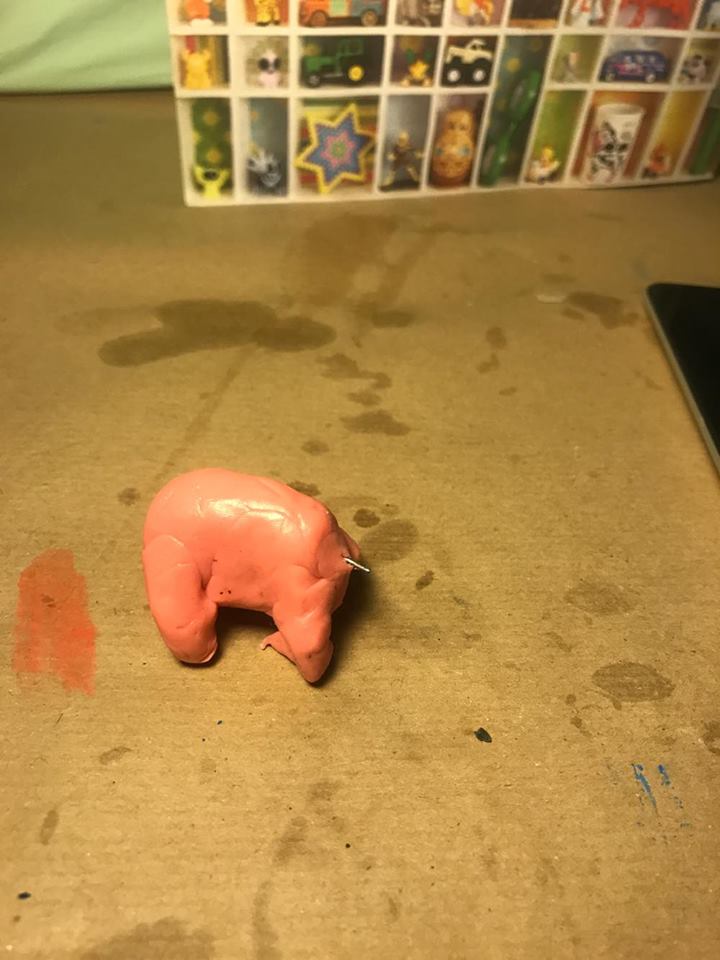
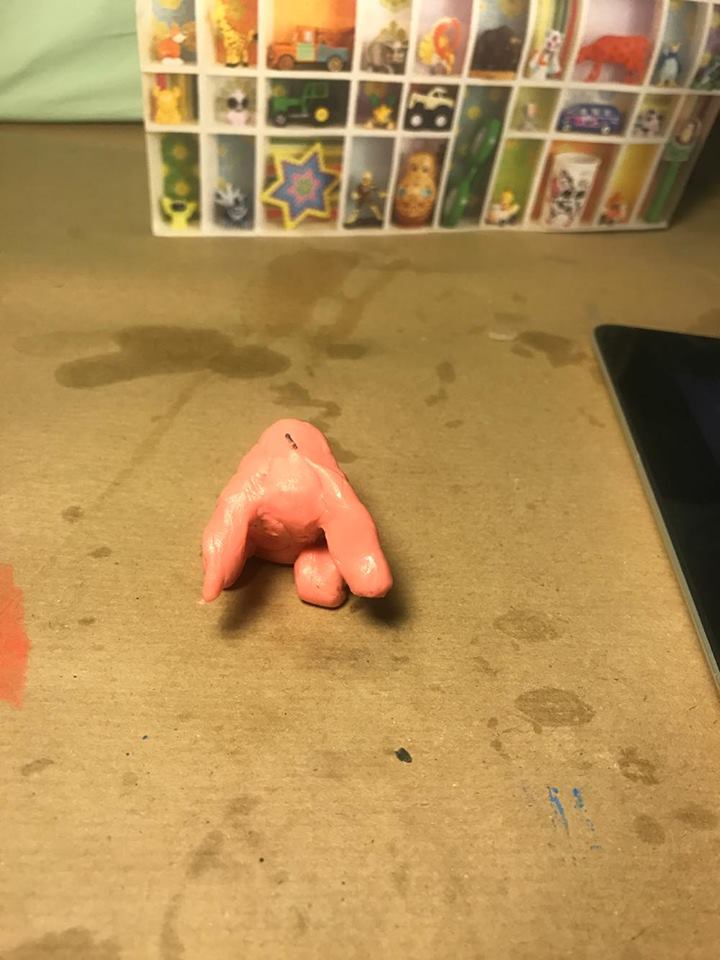
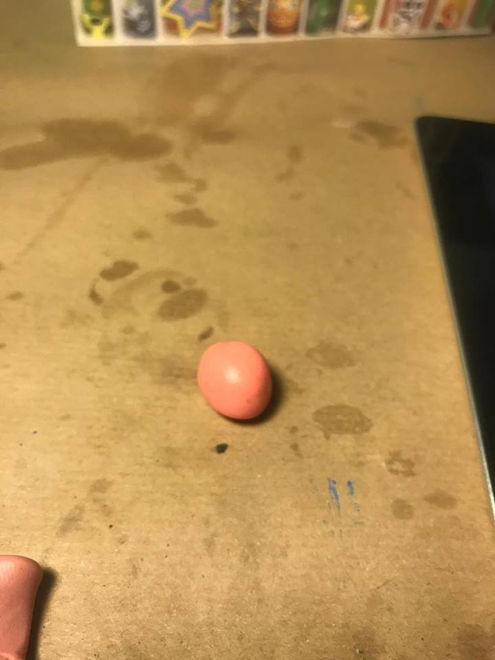
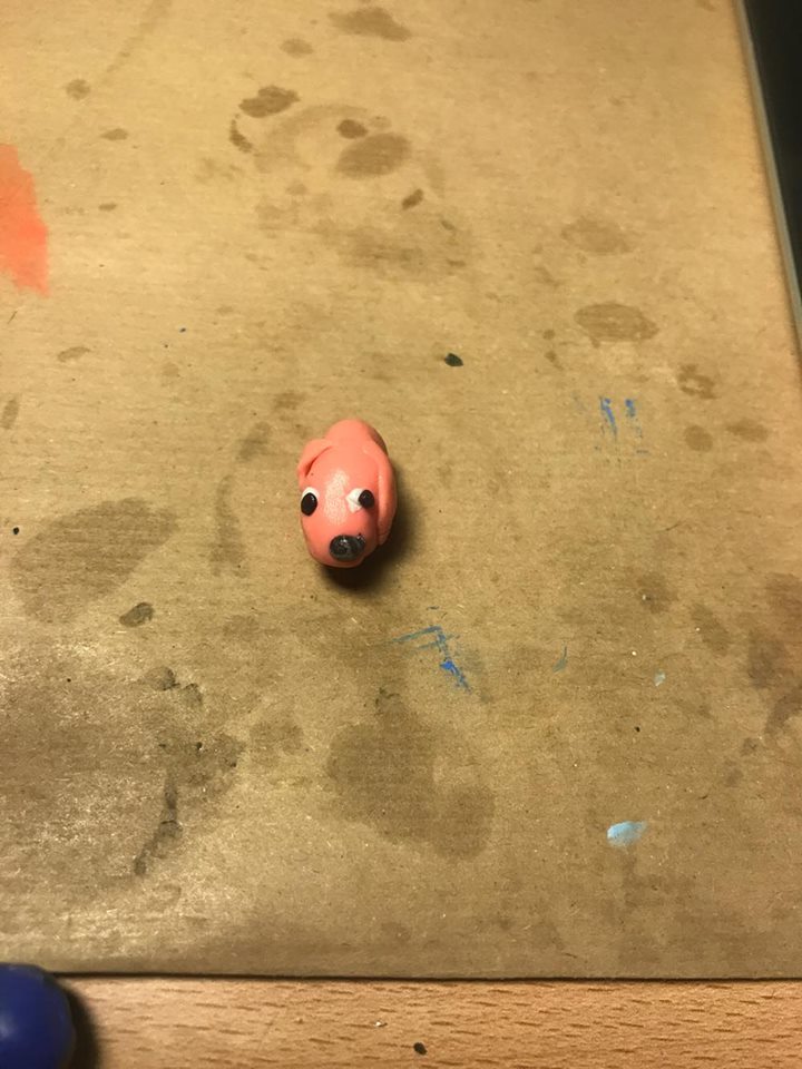
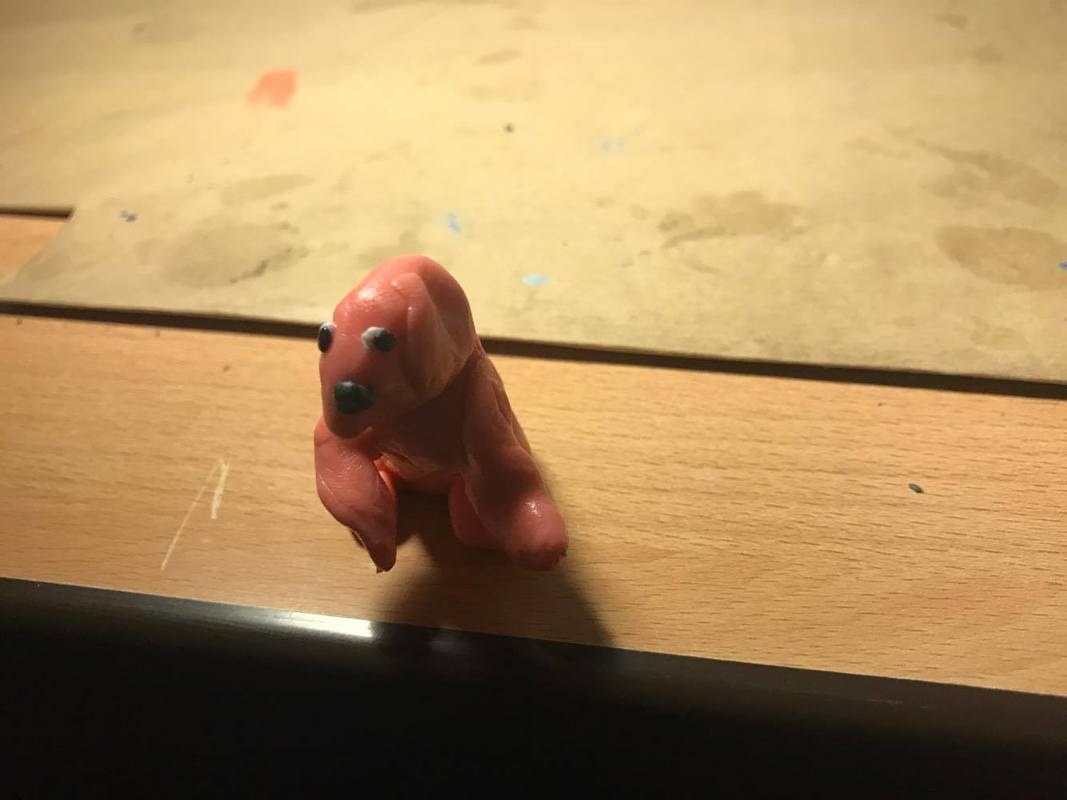
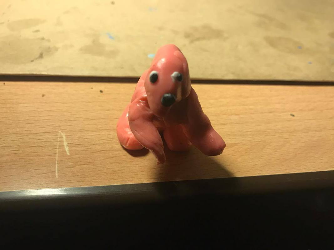
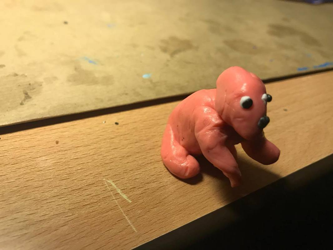
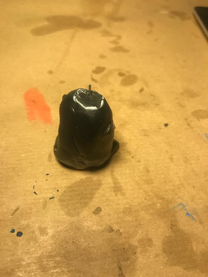
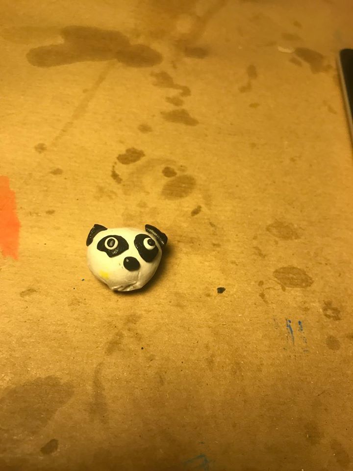
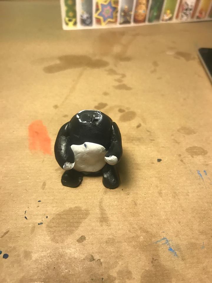
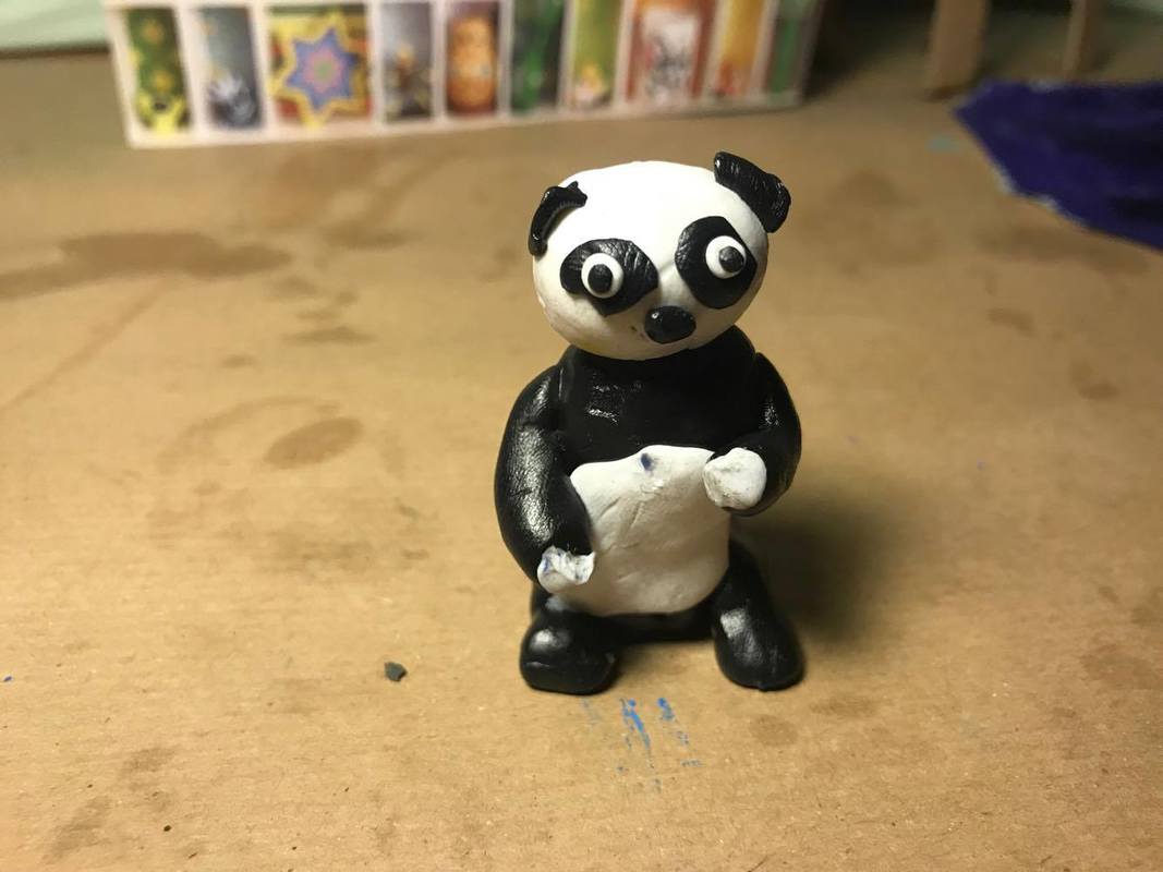
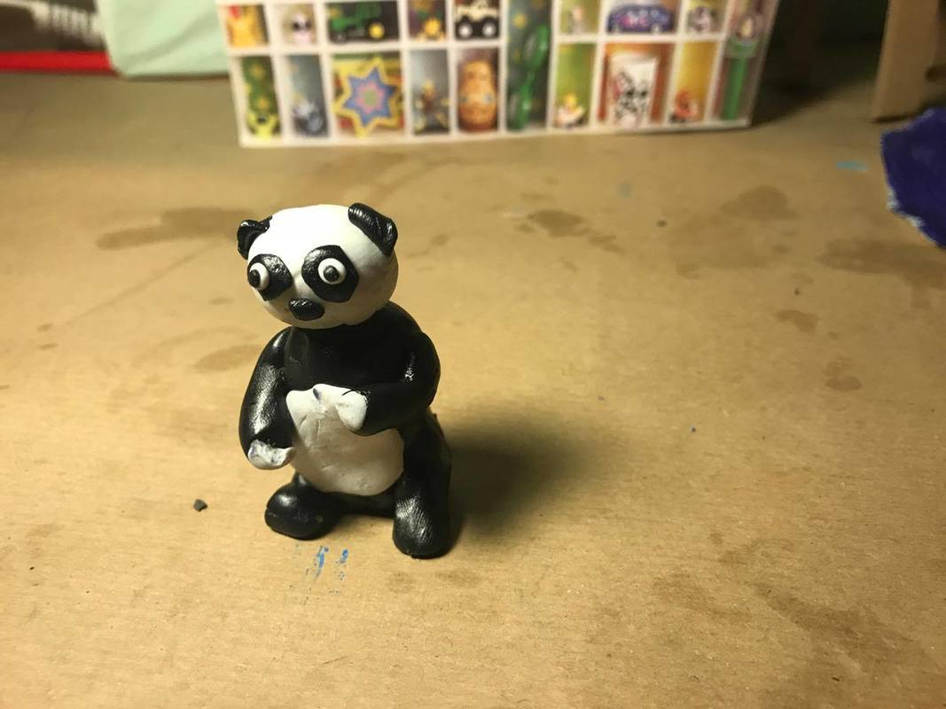
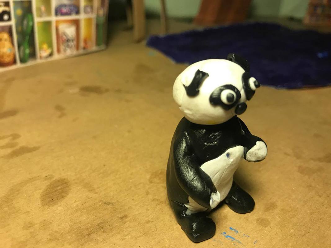
Building my clay models


Filming
When creating my characters I made sure that I had my final concept art next to me as reference and so I know what the final outlook should look like. I first started with the correct coloured clay that I needed for each character, for the dog I needed a pale pink and for the panda I needed white and black. I first started to mould the body, so I know what the correct size would be needed for the faces. When moulding the bodies I kept putting them in with the set so I had an idea on what the characters would look like in the set and so I didn't make the characters too big or small for the set. When I had the basic body shape complete I then suck some wires on where the head, arms and legs to be. This is because it wild be easy for met o move the face, legs and arms when needed without breaking them off the body. I then made the arms and legs and stuck them onto the wire. When the body was complete I them started onto the head. When I was making the head I made sure that the head wasn't too big or small for the body, I did this by comparing the head to the body and either adding more or removing less clay from the head. When I had the correct head shape I started to add the small details such as the ears, eyes, mouth etc; I kept looking at the concept art for reference. When the head was complete and everything was right, I stuck the head onto of the body, making sure that the wire went through the head. When the head and body were both attached together I made sure to add any finishing touches onto the characters scubas adding in a tail, any small details on the feet or arms etc.
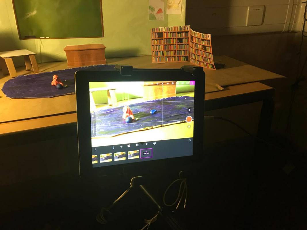
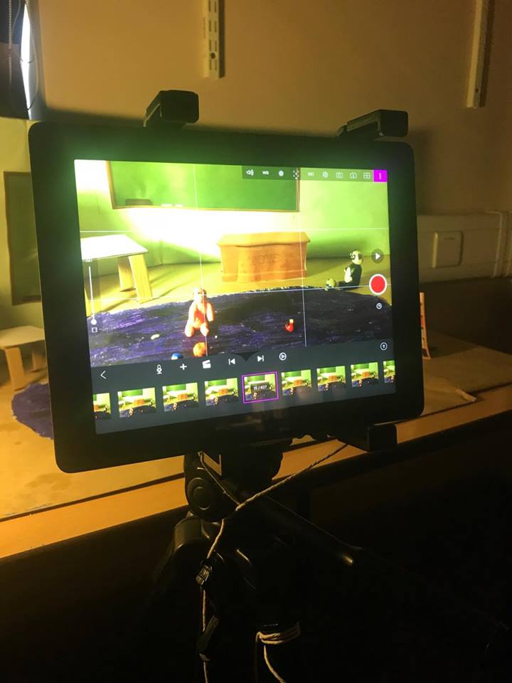
Editing the animation
The animation so far (50% done):
In this I have only edited the shots together and fixed the lighting. I haven't added any sound onto it nor have I added any 'finishing touches'
In this I have only edited the shots together and fixed the lighting. I haven't added any sound onto it nor have I added any 'finishing touches'
Final Product:
(I will add in a voice over in the screen recording when I have time)
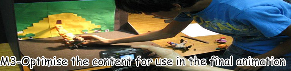
Size vs Quality
-What happens when you make the frame smaller?
For my fps I choose to have 16fps, this is because I feel that by having it slow it means that the movements in the video are quite smooth. When experimenting with other frames I realised that by having anything higher than 16 it goes on too fast and anything lower is too slow. The typical fps that is commonly used is 24fps, which is used a lot for TV, I felt that 24fps was too fast. Also, I had to consider the target audience, I think that by having it 16fps it means that the movement will be slow meaning that the target audience will be able to understand what is going on fully. Because my target audience is quite young it means that the may not be able to understand things as quickly as adults, which is one of the reasons why I have chosen 16fps. I felt that it has to go quite slow because then the story will be easily picked up on by the audience.
Frame Optimisation
-What exactly is this?
Frame Optimisation is where you convert the final product into a file, depending on what platform the product will be on. For example if the product was to go on for a phone, the file type of that product will be for a phone instead of for a DVD
-Why would it affect you project?
This would affect my project mainly because I need to export my product onto the correct file type for the corrects distribution. In the client brief it asks 'The animation must be exported in a format that would be suitable for distribution across TV Broadcasters and the web' This would affect my project because if I was to export it onto a file that is suitable for a iPhone it would mean that I am not meeting the clients requirements and I would not be following the clients brief. It would also mean that the product will not be able to be distributed onto the media platforms the client wants them to be on.
Colour Optimisation
-What exactly is this?
Colour optimisation is where the media product has the best colour it could possibly be when exporting it. Meaning that the colour quality of my animation is very good and isn't pixelated or that the colours aren't in high definition.
-Why would it affect you project?
This would affect my product mainly because if I don't fully optimise the colour in my product then the overall quality of my product won't look very good. This is because the colour might fade in or will be very pixelated, to make sure that the colour is good I would need to optimise it on final cut pro and make sure it is to high quality and standard. It will also affect my product because if I do optimise the colour to the highest quality it means that the colour will stand out and look very profession and aesthetically pleasing.
File Compression Techniques
-What exactly is this?
File compression techniques is when exporting the media product is making the file size as small a s possible so it is easy to upload and distribute on all types of platforms such as Youtube, DVD ext.
-Why would it affect you project?
This would affect my project mainly because if I don't compress my file it would mean that the file size of my exported product will be too big, therefor it will be harder to distribute it. This is because if I choose to distribute my product onto YouTube and the file size was too big then it would mean that it would be unable to upload onto Youtube or it could take a very long time for it to be uploaded. Also, if the file size was too big it would mean that it would take up a lot of storage, meaning that the client wouldn't necessarily like it. It wouldn't help the client either as because they may want me to export onto DVD because they would like to play it onto they channel, and I wouldn't be able to do that as the file size is too big. It isn't convenient for the client if I didn't compress my file.
Test plan:
Unit 10 test plan by Netherhall MediaStudies on Scribd
Audience Feedback:
Screen Tests/Focus Group:
|
Questionnaire:
|
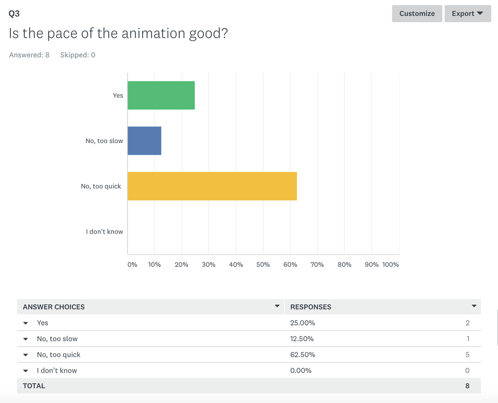
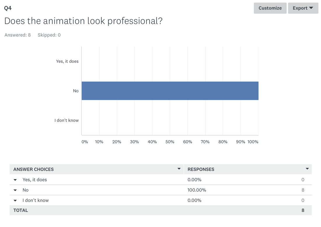
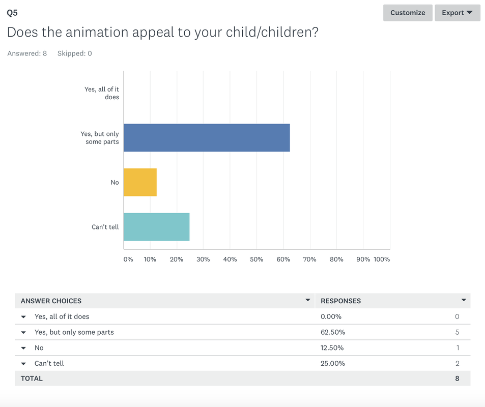
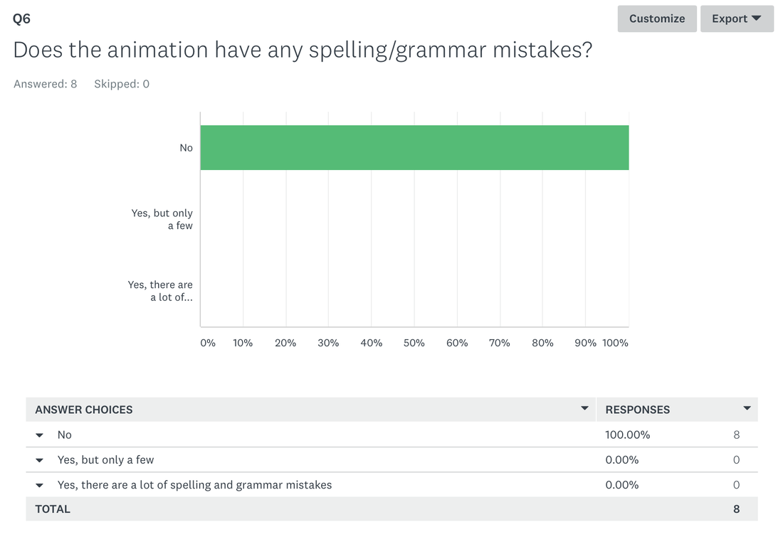
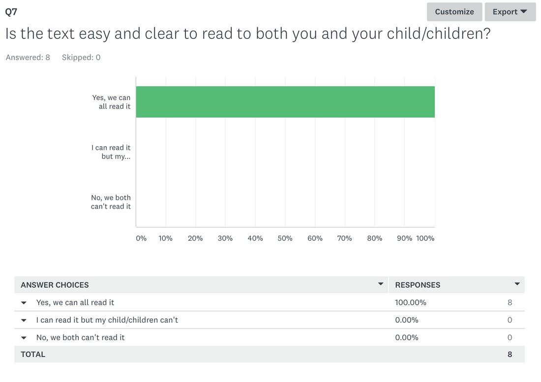
Results from questionnaire:
|
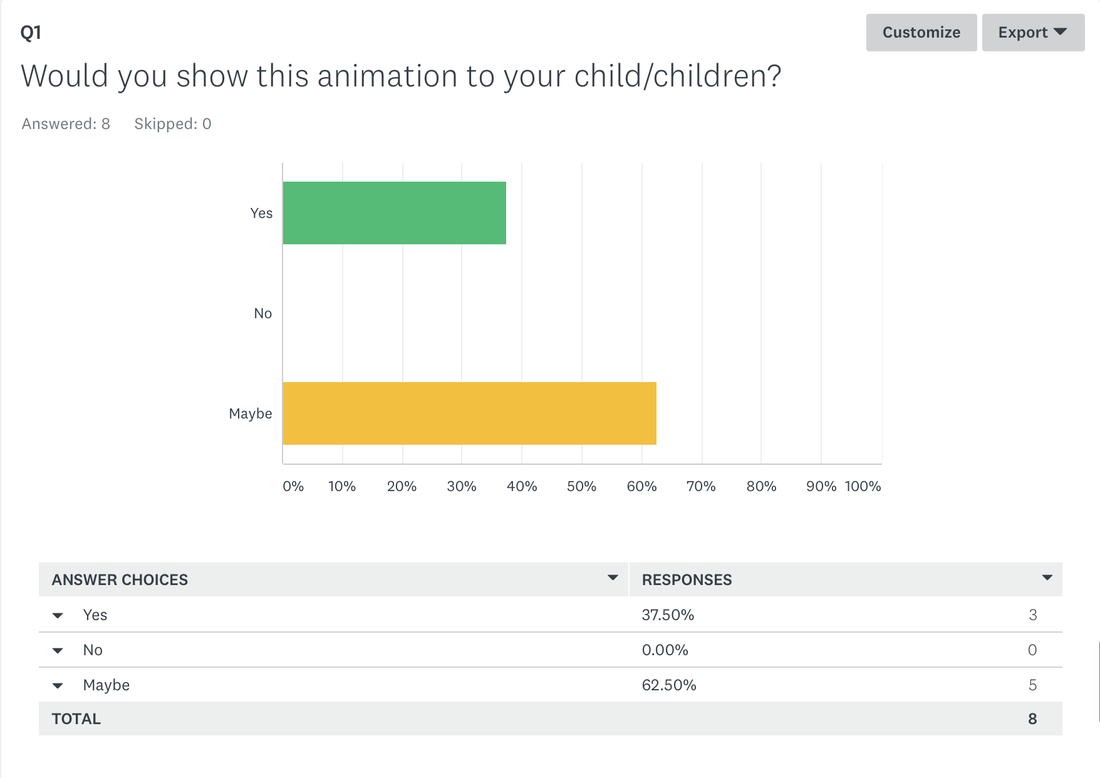
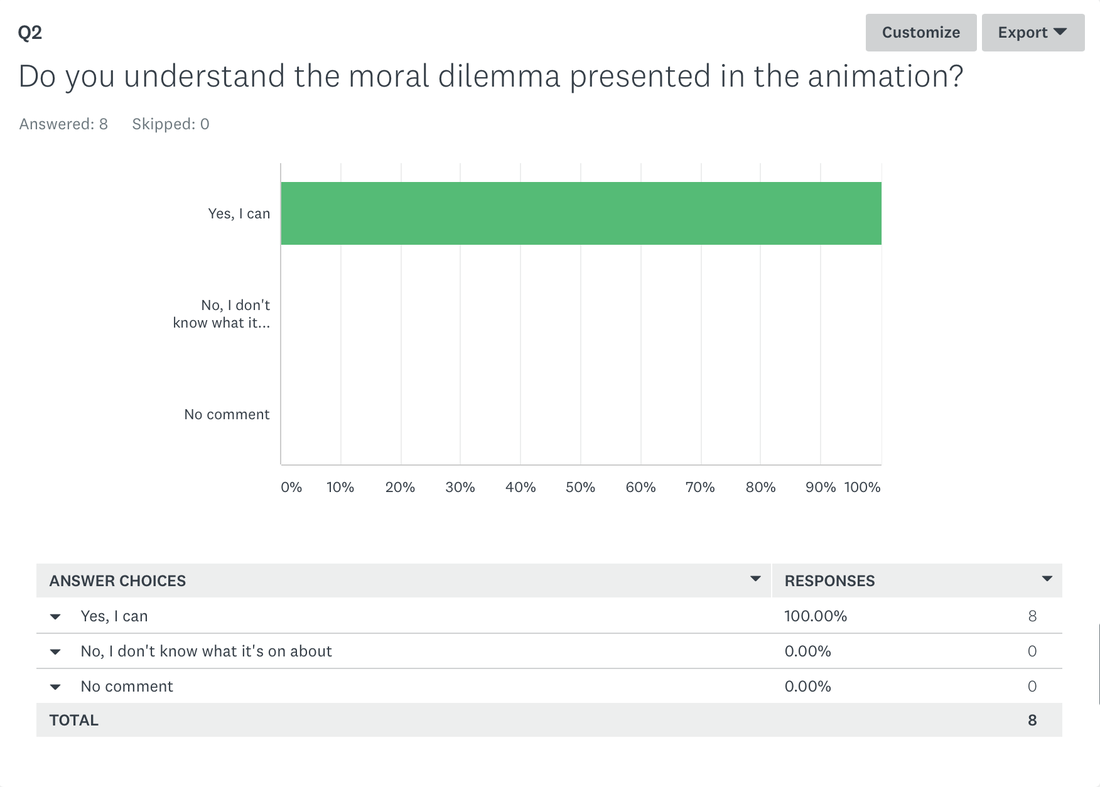
From my audience feedback, does it meet the clients brief and is it fit for purpose?
The purpose of the animation was to educate young children, from the brief it said "You have been asked by company TellAStory Ltd. to produce a short animation that tells a story to young people still in education. The story can be in any genre but must be creative and new and have a recognisable moral at the end" This meant I had to produce an animation that would tell an engaging story whilst teaching them a moral dilemma. From the audience feedback I have received, I think that I have met the client brief as the audience feedback said that they understood what the moral dilemma was and that they found the animation entertaining for them. The brief also asked that the target audience of the animation would be young people, although not specifying the age. I have met this part of the client brief as I have made sure to target children aged between 0-6 years old. I ave made sure to target this specific age range by looking at other animations that are targeted to them and looking at what made them successful to the target audience. By looking at other animations, I have noticed that they mainly use animals, because of this I have made sure that my characters are of animals. I think that my animation is fit for purpose as it has met the client brief and from the target audience feedback, they enjoyed it. I know this from the focus group and from the questionnaire. Both said that the target audience enjoyed it and understood the moral dilemma.
The purpose of the animation was to educate young children, from the brief it said "You have been asked by company TellAStory Ltd. to produce a short animation that tells a story to young people still in education. The story can be in any genre but must be creative and new and have a recognisable moral at the end" This meant I had to produce an animation that would tell an engaging story whilst teaching them a moral dilemma. From the audience feedback I have received, I think that I have met the client brief as the audience feedback said that they understood what the moral dilemma was and that they found the animation entertaining for them. The brief also asked that the target audience of the animation would be young people, although not specifying the age. I have met this part of the client brief as I have made sure to target children aged between 0-6 years old. I ave made sure to target this specific age range by looking at other animations that are targeted to them and looking at what made them successful to the target audience. By looking at other animations, I have noticed that they mainly use animals, because of this I have made sure that my characters are of animals. I think that my animation is fit for purpose as it has met the client brief and from the target audience feedback, they enjoyed it. I know this from the focus group and from the questionnaire. Both said that the target audience enjoyed it and understood the moral dilemma.
Justify the length of your animation
When you look back at LO1 was your sequence the right length? You can justify this by comparing it to a product in the real world that was similar.
I think that I don't think my animation was long enough as looking back at my audience feedback they didn't really understand the storyline and the moral dilemma. I think I should've made my animation longer as then the audience would be able to understand it. Because the target audience was young children they may need the animation to be longer to fully understand what is going on. Comparing my animation to popular moral dilemma animations such as Timmy Time, I can tell that my animation is significantly shorter. Timmy Time runs about 10 minutes whilst mine is only 2 minutes. I think that I should've at least made my animation for 5 minutes as that would allow the story to fully develop and help tell the moral dilemma in fuller detail so there isn't an confusion.
What could have been done differently in the planning, production and edit? Be honest and extremely critical of your work here.
Pre-production-During pre production I could've researched more into my target audience and see what they really would like and want for an animation. I would've talked to the parents of the target audience and see what they wanted, just so I could produce a animation what really targets the audience and gives them what they want. I would also perhaps have done different screen tests of different formats of animation, to see what looks good and what doesn't. I would also have made my characters drawings a bit better, as they weren't very cleared and detailed, therefor I struggled when making them
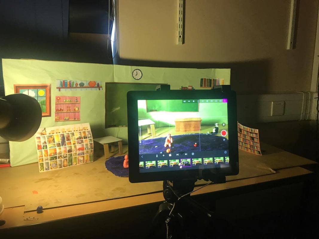
Production- For production, I feel that I should've given myself more for the production stage, as I was very rushed for time and you could tell with the animation; the shots weren't well shot and the clips of the different shots were very short. I think that if I had given myself more time then I would've been able to comfortably shoot and also create my characters to a high quality and make them look fun and friendly. I think that during the production stage, I should've made sure that I lighted the set correctly. Looking back now, I can see that the set looked a bit yellow and the lighting changed in some scenes, I think that if I could do it again I would've used correct studio light instead of bedside lamp and placed them on a stand and made sure not to move them or touch them.I would've also made sure that I lighted my set form all angles, so that there wouldn't be very visible shadows. I also think that I should've used a camera instead of an iPad, this is because I think that the shots would've looked better. Also, because I used an iPad it meant I had to use a tripod for the iPad, and I found that the tripod would move every time I took a picture. This meant that each picture looked slightly different from the rest, meaning it wasn't very consistent.
Post production (editing)- I think for editing, I could've maybe stabilised the short, just so they weren't too shaky. I would've also corrected the lighting mistakes, just so that the overall animation doesn't look yellow. By doing all of these, I think that my animation would look more professional and of a higher quality.
If you had to do something like this agin in the future with a totally different brief- what would you do differently and why? Please make a list and and not just reference one or two things. Discuss this in detail.
I think that if I had to do this again with a different brief and it was a high cost production I would've done multiple things differently. Because what I made was coming from a low budget production and that I wasn't very experience it meant that my animation didn't look as professional and real as a high budget production would be because high productions spend more time and detail in each stage.
I feel that if I were a high budget production I would've :
When you look back at LO1 was your sequence the right length? You can justify this by comparing it to a product in the real world that was similar.
I think that I don't think my animation was long enough as looking back at my audience feedback they didn't really understand the storyline and the moral dilemma. I think I should've made my animation longer as then the audience would be able to understand it. Because the target audience was young children they may need the animation to be longer to fully understand what is going on. Comparing my animation to popular moral dilemma animations such as Timmy Time, I can tell that my animation is significantly shorter. Timmy Time runs about 10 minutes whilst mine is only 2 minutes. I think that I should've at least made my animation for 5 minutes as that would allow the story to fully develop and help tell the moral dilemma in fuller detail so there isn't an confusion.
What could have been done differently in the planning, production and edit? Be honest and extremely critical of your work here.
Pre-production-During pre production I could've researched more into my target audience and see what they really would like and want for an animation. I would've talked to the parents of the target audience and see what they wanted, just so I could produce a animation what really targets the audience and gives them what they want. I would also perhaps have done different screen tests of different formats of animation, to see what looks good and what doesn't. I would also have made my characters drawings a bit better, as they weren't very cleared and detailed, therefor I struggled when making them
Production- For production, I feel that I should've given myself more for the production stage, as I was very rushed for time and you could tell with the animation; the shots weren't well shot and the clips of the different shots were very short. I think that if I had given myself more time then I would've been able to comfortably shoot and also create my characters to a high quality and make them look fun and friendly. I think that during the production stage, I should've made sure that I lighted the set correctly. Looking back now, I can see that the set looked a bit yellow and the lighting changed in some scenes, I think that if I could do it again I would've used correct studio light instead of bedside lamp and placed them on a stand and made sure not to move them or touch them.I would've also made sure that I lighted my set form all angles, so that there wouldn't be very visible shadows. I also think that I should've used a camera instead of an iPad, this is because I think that the shots would've looked better. Also, because I used an iPad it meant I had to use a tripod for the iPad, and I found that the tripod would move every time I took a picture. This meant that each picture looked slightly different from the rest, meaning it wasn't very consistent.
Post production (editing)- I think for editing, I could've maybe stabilised the short, just so they weren't too shaky. I would've also corrected the lighting mistakes, just so that the overall animation doesn't look yellow. By doing all of these, I think that my animation would look more professional and of a higher quality.
If you had to do something like this agin in the future with a totally different brief- what would you do differently and why? Please make a list and and not just reference one or two things. Discuss this in detail.
I think that if I had to do this again with a different brief and it was a high cost production I would've done multiple things differently. Because what I made was coming from a low budget production and that I wasn't very experience it meant that my animation didn't look as professional and real as a high budget production would be because high productions spend more time and detail in each stage.
I feel that if I were a high budget production I would've :
- Different storyline: The storyline I choose was very constructing in what I could do as a producer and director, I felt like I had to stick to it and I couldn't elaborate on it. I think that if I choose a different storyline I would be able to develop it easily and expand on the story and perhaps make it more entertaining for kids whilst they learnt on it.
- Dialogue: I think that because none of the animals had any dialogue, it mean that the animation was very boring. I think that if I made the animals talk and get them to make animal sounds it would engage the audience a bit more and make it a bit more entertaining.
- Different animation style: Because I choose to do the animation in 3D form, it meant that I had some difficulties in creating my characters. I found it difficult to mould the characters from clay and found it difficult to find the right clay that would I could my characters into. Because of this, I ended up using a low quality clay that didn't look good on screen and that my characters didn't look the way that I planned. This lead to my characters looking low quality and not something you would find in a children's animation. I feel that next time I would've done my animation in either line drawing or 2D as I think that would be easier to produce than 3D and look better
- High quality equipment and specialist: I think next time, I would make sure that the animation wold be high budget as that would mean I would be able to use high quality equipment and software to make my animation. I would also be able to bring in specialists to help such as artists that could help me create my characters, if I had all of this it would mean that my animation over all would look better and look more professional.
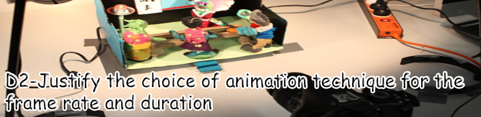
Justify the frame rate used for the medium
24fps = Standard TV Pictures) did you use that many frames when creating your animation or not? Why? Justify your actions here.
For my animation I didn't use 24 fps, this is because during the testing period I found that 24 fps was too fast for my liking and it didn't transition smoothly. I also found that when playing my animation is 24 fps that the animation would seem very 'jolty', meaning that it would make a weird movement overtime the characters moved or when I used a different shot. I think this is because I only took about 300-350 photos only, meaning that if I did use 24 fps it meant that the movement would look jolty as I didn't take a lot of photos of the different movement. I think that I maybe took more photos and moved my characters little by little more, than I would be able to use 24 fps as all the movement would be captured and look smoother.Also, because my animation would be around 2 minutes long, I felt that the animation would be very quick if I used 24 fps, meaning that the character movement and the storyline would be moving quicker than I wanted and therefore reduce my target running time, I also think that that because target audience is a young audience, it meant that they would need sometime to be able to understand the storyline and what is going on. There if I used 24 fps, it meant that my target audience wouldn't be able to understand what is going on and they wouldn't get the moral dilemma. I think that if my animation was longer, such as 10 maybe 15 minutes long, then I could perhaps make it into 24 fps, as it wouldn't look that fast because the animation is longer.
Did you use the right amount of frames when creating your animation? Why? Why not? Justify your actions
I used 16 fps for my animation and looking back I don't think it is the right amount of frames being used. This is because in some scenes the animation is a bit 'jolty' and not as smooth as I want it to be. For example, in the opening where Dog is playing with his car the characters movements doesn't look as smooth as I would like it to be. I feel like if I used perhaps 15 fps it would look a bitter smoother than 16 fps as it is a frame slower meaning that perhaps the characters movements would be slow and therefor would go more smoothly. I used 16 mainly because during the testing period the test shoot looked smooth and the pace of it was nice. During the testing phase
